“The real fact of the matter is that nobody reads ads. People read what interests them, and sometimes it’s an ad.” – Howard Luck Gossage.
For as long as there has been something to sell, we have used advertising to draw the public’s attention to a product, service, or event to drum up business.
There has never been a standard for what makes an ad good, but there have been approaches that have historically worked better than others, for example, posters/pamphlets with a large image and less text have always worked well.
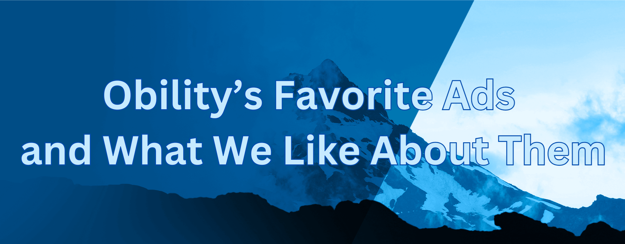
Obility has created this guide to share insights into what makes advertising effective, using standout examples that resonate with the audience and drive conversion.
For 14 years, Obility has been helping B2B tech and SaaS companies achieve measurable, sustainable growth through scalable digital marketing services such as SEO, paid search, paid social, and marketing operations.
Clients such as Snowflake, Cloudflare, and Moz have relied on Obility’s expertise to navigate the complexities of B2B marketing in the past.
All that to say, we know what we’re talking about, because Obility has the experience and expertise in advertising. Read on to read more about our take on modern ads, what works, and what can be improved.
Short History of Ads
“Stopping advertising to save money is like stopping your watch to save time.” – Henry Ford.
From papyrus scrolls to smartphones advertising has always been about grabbing attention. Here’s a quick look at how it evolved from ancient town criers to today’s digital economy.
- Ancient Trade Signs: Long before written language, merchants used symbols and images in their shops or stalls to identify their goods and services. These early “trade signs” were precursors to modern logos and branding.
- BCE:
- Egyptians used papyrus for messages and wall posters.
- Commercial messages and political campaigns were found in Pompeii and Arabia.
- Lost and found ads appeared on papyrus in Greece and Rome.
- Wall painting for advertising dates back to Indian rock art from 4000 BCE and continues in parts of Asia, Africa, and South America.
- Town Criers: In medieval times, town criers would announce news and commercial messages throughout cities and towns. This was a form of public address advertising that relied on word-of-mouth and personal presence.
- 18th Century: The first printed recruitment ad, “Take Notice,” appeared around 1776. It was a recruiting poster for the Revolutionary War.
- 19th Century:
- Penny papers emerged, offering inexpensive newspapers with classified ads and local business promotions.
- Billboards appeared in the 1830s.
- VB Palmer’s opened as the first advertising agency in the 1840s.
- Kodak began promoting its brand, not just its products, in the 1890s.
- 20th Century:
- Ford introduced publicity ads in 1908.
- Radio soap operas with ad breaks started in the 1920s.
- The first television commercial aired in 1941 for $9.
Advertising research intensified from the 1960s to the mid-1990s, leading to the birth of data-backed advertising that gave us, demographics, focus groups, performance metrics, targeting (though not as deep as it exists today), and everything we associate with advertising today.
- Late 20th & Early 21st Century:
- SMS Ads came about in the late 90s.
- AdWords launched in 2000 and started placing ads alongside search results.
- Admob and Millennial Media followed in 2006.
- The iPhone launched in 2007, and Android in 2008.
Why Do We Need Advertising?
“People hate advertising until they lose their cat” – David Droga
Because at all times in human history, there’s been a means of directing people to resources they might need. Cave drawings for where food and predators were sighted, smoke signals for where tribes were located, road markers pointing out the location of major hubs, catalogs, and now advertising.
One must also better understand the audience by getting detailed demographic data and customer profiles so they can prefer one brand over another.
How Do We Know An Ad is Good?
“People screen out a lot of commercials because they open with something dull…When you advertise fire-extinguishers, open with the fire” – David Ogilvy, founder of Ogilvy advertising agency
There’s an old meme about visual hierarchy floating around the web that kind of goes like this:
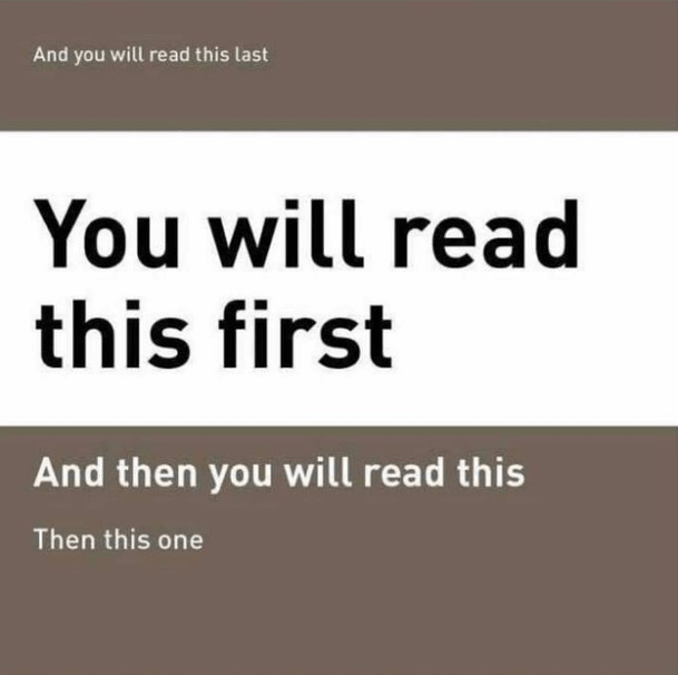
While ads work subjectively, there’s also an optimal path we can take to give our viewers the most information while also nudging them toward a sale. It’s a fine balance.
A good ad balances creativity, clarity, and purpose while tailored to its audience. Here’s what makes an ad effective:
Considerations
- Understanding the Audience: Identify who the ad is targeting, their interests, and their challenges. Tailor every element to their needs and expectations.
- Emotional Connection: Make the ad resonate emotionally. Humor, nostalgia, or curiosity can create a memorable bond with the audience.
- Cultural and Contextual Relevance: Ensure the ad aligns with the audience’s values and experiences to avoid disconnect or confusion.
- Brand Consistency: Reinforce the brand identity by maintaining consistent colors, fonts, and messaging. This helps build long-term recognition.
- Testing and Optimization: Regularly experiment with variations of the ad to identify what performs best and use insights to improve.
Design
- Clear and Focused Message: Stick to one main idea. Avoid cramming too much information, as it can dilute the impact.
- Image-to-Text Ratio: Strike a balance between visuals and text. Use images to grab attention and concise text to deliver the message.
- Language and Tone: Match the language and tone to the audience. Avoid jargon unless it’s commonly understood within the target group.
- Strong Visuals: Use clean, appealing visuals that complement the message without overwhelming it.
- Call to Action (CTA): End with a clear, actionable step like “Learn more” or “Sign up,” guiding the audience toward the next step.
- Placement and Medium: Adapt the ad format to the platform where it will appear. For example, a social media ad should be short and attention-grabbing, while an email can allow for more detail.
A good ad grabs attention, delivers value, and inspires action with a clear purpose and thoughtful design.
Here are some great ads we’ve seen today and the ways we can make them pop out
Our Favorite Ads and What We Like About Them
Zoom Work Transformation Summit
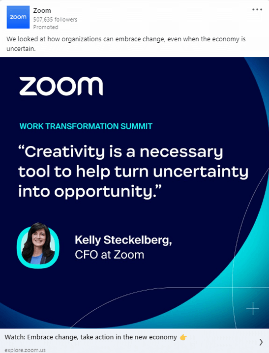
- What works:
-
-
- Clearly visible speaker quote and picture
- High profile speaker
- Eye-catching design and color scheme
- Good balance of text and image
-
- What could be improved:
-
- The description is short and a bit vague. We need this to pop out to audiences and capture their attention. What interesting facts, details, pain points, or metrics can we bring forward to audiences in a relatable way?
- The name of the summit is smaller than the quote from the Zoom CFO – people might need a second to understand what is being promoted.
- The post could use a stronger hook.
- The headline sounds robotic and could benefit from being made specific.
- Add event date and time and any other points to note, like on-demand language.
- If it is on-demand, add the length of the video in the description
- If it is in-person, mention if space is limited to drive urgency
- We need a CTA added that makes the next steps clear to audiences.
HubSpot State of Marketing 2022 UK Report
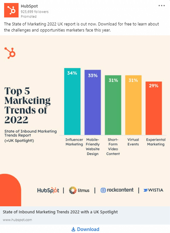
- What works:
-
-
- Depicts what to expect if a user decides to download the asset.
- All the most important information is shown and legible, with relevant stats clearly accessible.
- Use of industry logos to improve credibility.
- Great use of brand design.
-
- What could be improved:
-
- The description could be enhanced by mentioning information most relevant to the audience. If this report is best suited for a specific audience, let’s say c-suite, let’s address them in the copy.
- Could use some reference for the data and what these numbers indicate.
- We need a CTA added that makes the next steps clear to audiences.
- There is a lack of urgency in the messaging (and the CTA). Another version of the CTA could’ve been “Gain actionable insights now”
Amazon Web Services

- What works:
-
-
- Compelling to audiences as they care about cloud platforms making it simpler to adopt tech, such as AI.
- Great use of branding.
- The big bold data point draws readers’ attention to the rest of the post.
- The text below the stat adds context.
- Clear target audience from the get-go.
-
- What could be improved:
-
- The obvious stock image should be replaced.
- Image resolution should be 1080×1080 as the rectangle version is an older design choice.
- Making the outcome a little clearer, is this a demo, asset, report, or ebook?
- The copy used is generic signaling that the ad is relying on the AWS brand to do the heavy lifting rather than the ad.
- It could’ve been more specific benefit-driven, like “AWS: Modernize Faster, Build Smarter, Innovate with Confidence”
ActiveCampaign Product Update
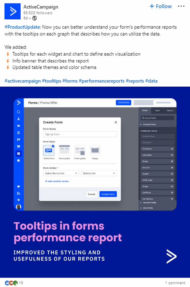
- What works:
-
-
- Creative use of emojis to help make the ad copy stand out.
- In-depth social copy highlighting the updates made to the software, enticing both current and potential customers
- Actual image of the tool
- Great use of colors and branding
- Well-formatted copy in an easy-to-glance format
-
- What could be improved:
-
- Lots of blue in the background. There’s an opportunity to improve how this image pops on user’s feeds.
- The company name is missing from the creative. The logo is included, but that might not be enough for audiences who are unfamiliar with ActiveCampaign.
- There’s no clear next step for the audience. It’s missing a clear CTA, something like “Explore the new features today” or “Learn how”
- The text says “product update”, link says “report”. Might get confusing.
Zoom One – 1st Ad
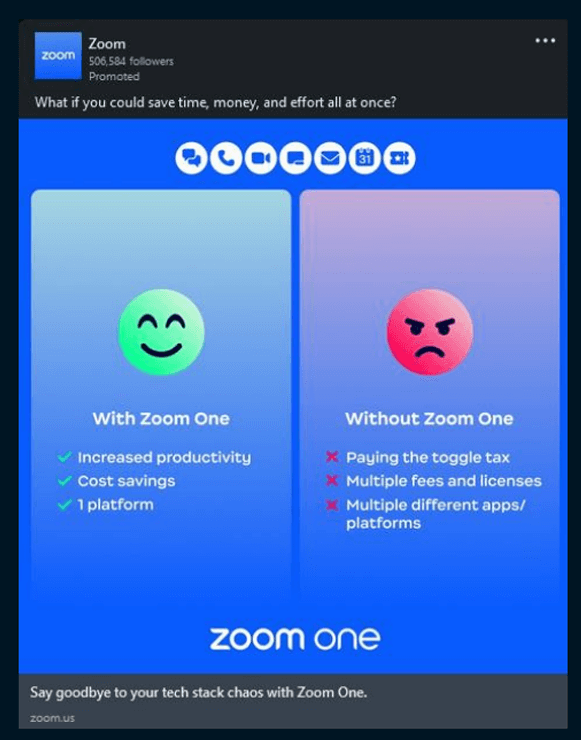
- What works:
-
-
- Great use of humor in the ad.
- Immediately addresses questions their audiences ask every day.
- Clear offer thanks to the before and after columns.
- A good summary of the benefits of using the product.
- Letting the brand do the heavy lifting instead of spelling everything out.
-
- What could be improved:
-
- Not super clear who the target audience is.
- Could use a little more clarity on features/offers, as the next steps aren’t outlined. It’s catchy, but it’s not clear where the user will go if they click this ad.
- CTA is a little too verbose.
Zoom One – 2nd Ad
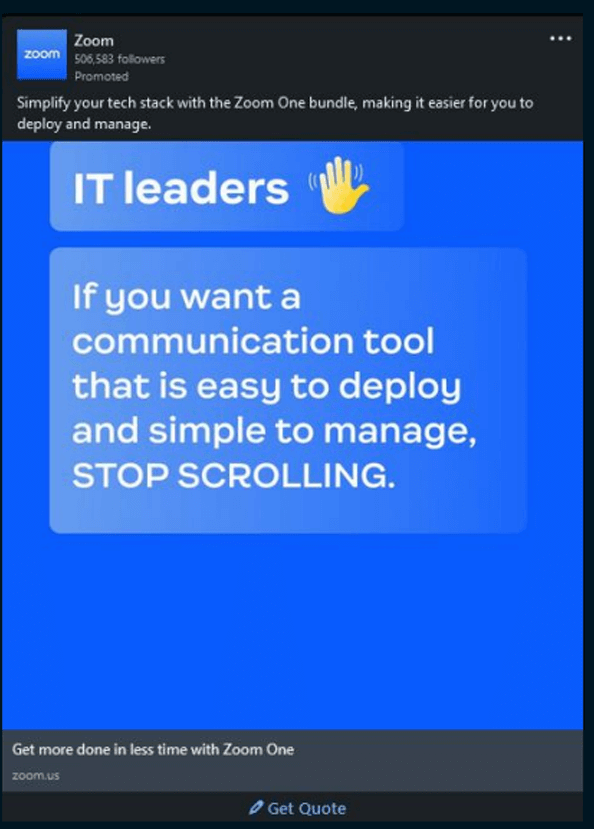
- What works:
-
-
- Speaking to the target audience directly.
- Great CTA.
- Clear offer.
- Chat window simulates a human element despite not showing people.
-
- What could be improved:
-
- This might work better as a motion graphic or video where we can see the scrolling happening.
- The second half of the image has a lot of bank space.
- The brand needs to be visible inside the creative.
- The caption says “Simplify your tech stack with the Zoom One bundle” assuming the target audience already knows what Zoom One is. This could use a little more information.
- Some sort of evidence on its efficacy would be nice.
Salesforce
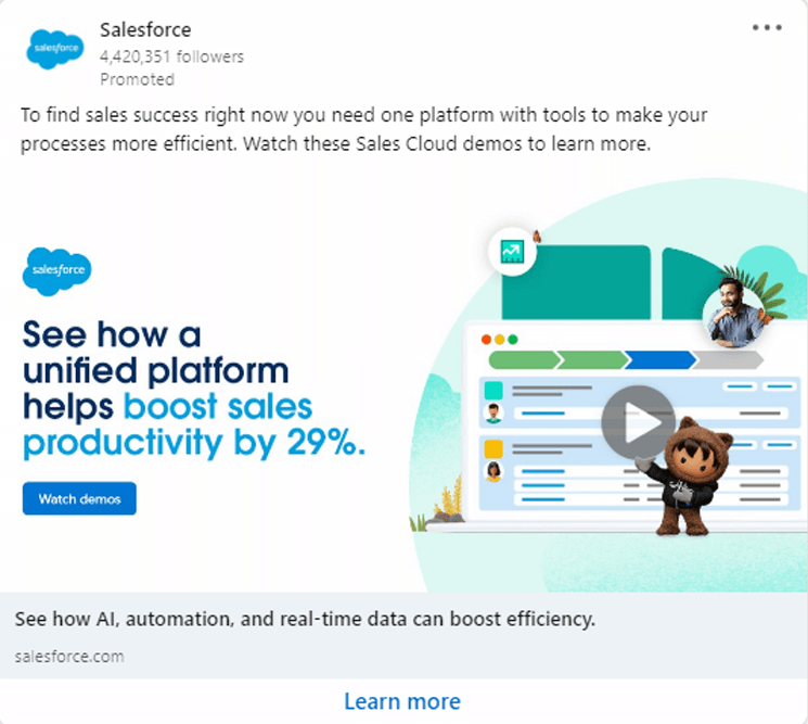
- What works:
-
-
- Use of a relevant and eye-catching stat
- Brand story consistent with their website
- Featuring a human element and a visual of the product
- The color makes it easy to glean info in a hurry
- Emoji is addressing the reader directly
- Using a CTA on the design
-
- What could be improved:
-
- It is broadly targeted to anyone in sales, which could be perceived as generic.
- The button says Watch Demos, CTA says Learn more. Could use a singular CTA.
Shopify Google Cloud
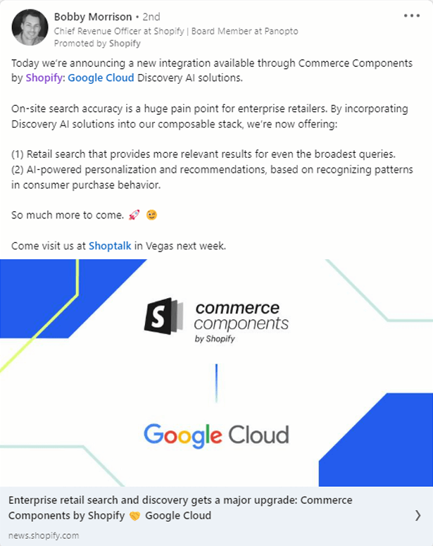
- What works:
-
-
- Long-form copy with information about the brand partnership, what the new offer is, and what pain points are being targeted
- Strong brand awareness
- The design makes it very clear what is being offered
-
- What could be improved:
-
- The purpose of the CTA is unclear. If it is to register for an event, there needs to be a button included.
- The design seems too simple. Not engaging enough to make someone stop scrolling.
- The copy mentions AI solutions but then nowhere else. This could be confusing.
ActiveCampaign Women’s History Month
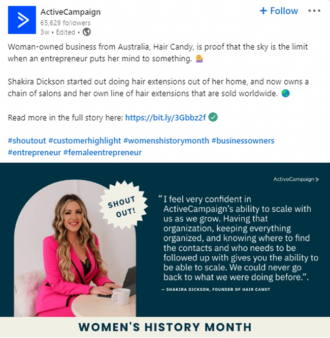
- What works:
-
-
- Great design with a human element, a quote, and eye-catching colors
- Kind of looks like a regular LinkedIn post, helping disarm readers.
- Human element
-
- What could be improved:
-
- The quote is on the long side.
- Some branding from the founder’s company could be useful.
- Some stats on just how successful the founder is (number of franchises, annual revenue) might make it more impactful.
Zendesk’s Internal Helpdesk – 1st Ad

- What Works:
-
-
- Clear CTA.
- Great use of branding.
- Speaking directly to the target audience.
- A healthy balance of text and images in the creative.
- The description does a good job of guiding readers to the rest of the ad.
-
- What could be improved:
-
- CTA and preceding copy could benefit from being made more actionable than “learn more”, and “An employee-friendly approach to internal service”
Zendesk’s Internal Helpdesk – 2nd Ad
- What Works:
-
-
- Great use of branding.
- A healthy balance of text and images in the creative.
- The description does a good job of guiding readers to the rest of the ad.
-
- What could be improved:
-
- The CTA button could help.
- No clear “next steps” for the users to take.
- Not very clear what pain point is getting solved.
HubSpot Google Ad Credits
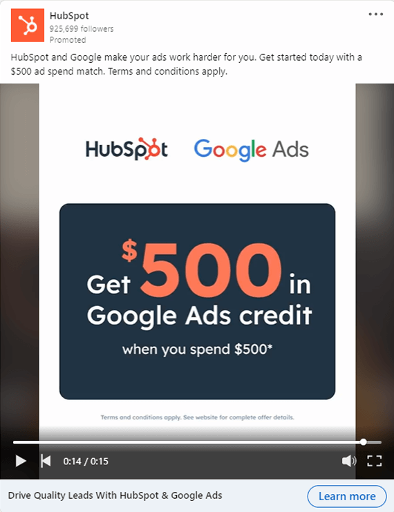
- What Works:
-
-
- Very clear offer without much text.
- Great use of brands
-
- What could be improved:
-
- CTA could be “claim now” to make it more actionable.
Box Platform
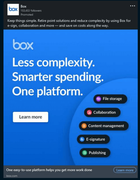
- What Works:
-
-
- Clear CTA.
- Good balance of text and images in creative.
- Clear offer.
-
- What could be improved:
-
- We’re happy with this ad as-is.
Zoom Report
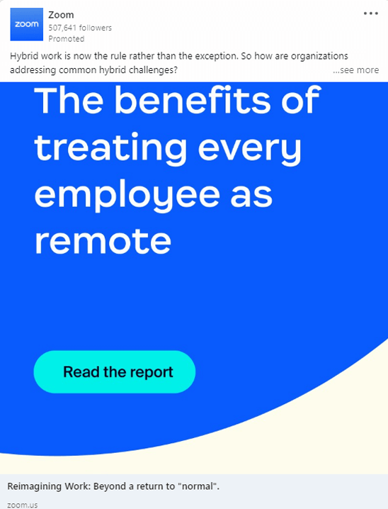
- What Works:
-
-
- It is clear what is on offer.
- The next steps are very clear for the user.
-
- What could be improved:
-
- CTA could have been a button
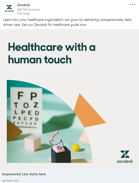
Zendesk Keynote
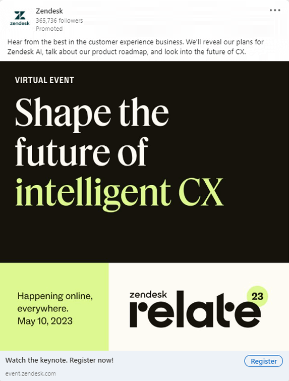
- What Works:
-
-
- Clear CTA.
- Great use of design to split the creative into 3 sections, so all the information is clearly visible.
- Clear offer
- Speaking directly to the target audience.
-
- What could be improved:
-
- We like this ad as-is.
Key Takeaways & Insights
Common Threads Among Successful Ads:
- Clear Messaging: Ads effectively highlight key benefits or stats, ensuring the core message is quickly understood.
- Strong Visuals: Eye-catching design, branding, and imagery draw attention and build credibility.
- Audience Focus: Content speaks directly to target demographics, using relatable language and addressing pain points.
- Compelling CTAs: Actionable and specific calls to action guide users to the next step.
- Credibility Elements: Use of stats, quotes, or testimonials reinforces trust and authority.
Actionable Advice for Businesses:
- Prioritize Simplicity: Keep your message concise and relevant, with a focus on benefits and outcomes.
- Use Engaging Visuals: Invest in design that aligns with your brand while being visually appealing.
- Target Specifically: Tailor copy to resonate with your audience’s needs and challenges.
- Emphasize Proof: Include data, testimonials, or examples to enhance credibility.
- Align CTAs: Ensure your call to action is clear, direct, and matches the content’s intent.
Contact us to see how we can help you improve your ad performance