Fresh ideas, proven strategies, and the occasional hard-earned lesson. Here you’ll find updates from our team of B2B marketing specialists, campaign wins worth bragging about, and insights on what’s shaping digital marketing right now.
Reddit threads are where buyers compare vendors, question pricing, and ask for recommendations. This list covers the agencies best positioned to help B2B technology companies build credible visibility where their buyers are already doing research.
How to Use AI in B2B Marketing: A 2026 Guide for B2B Teams
6 min read04.22.2026
AI in B2B marketing has gone from a talking point to something teams are actually building workflows around. At Obility, we've spent the past year doing exactly that, and we've learned a lot about where AI saves real time and where it still needs a human to catch what it misses.
This post covers the workflows we've built, the tools we're using, and the line we draw before anything touches a live account.
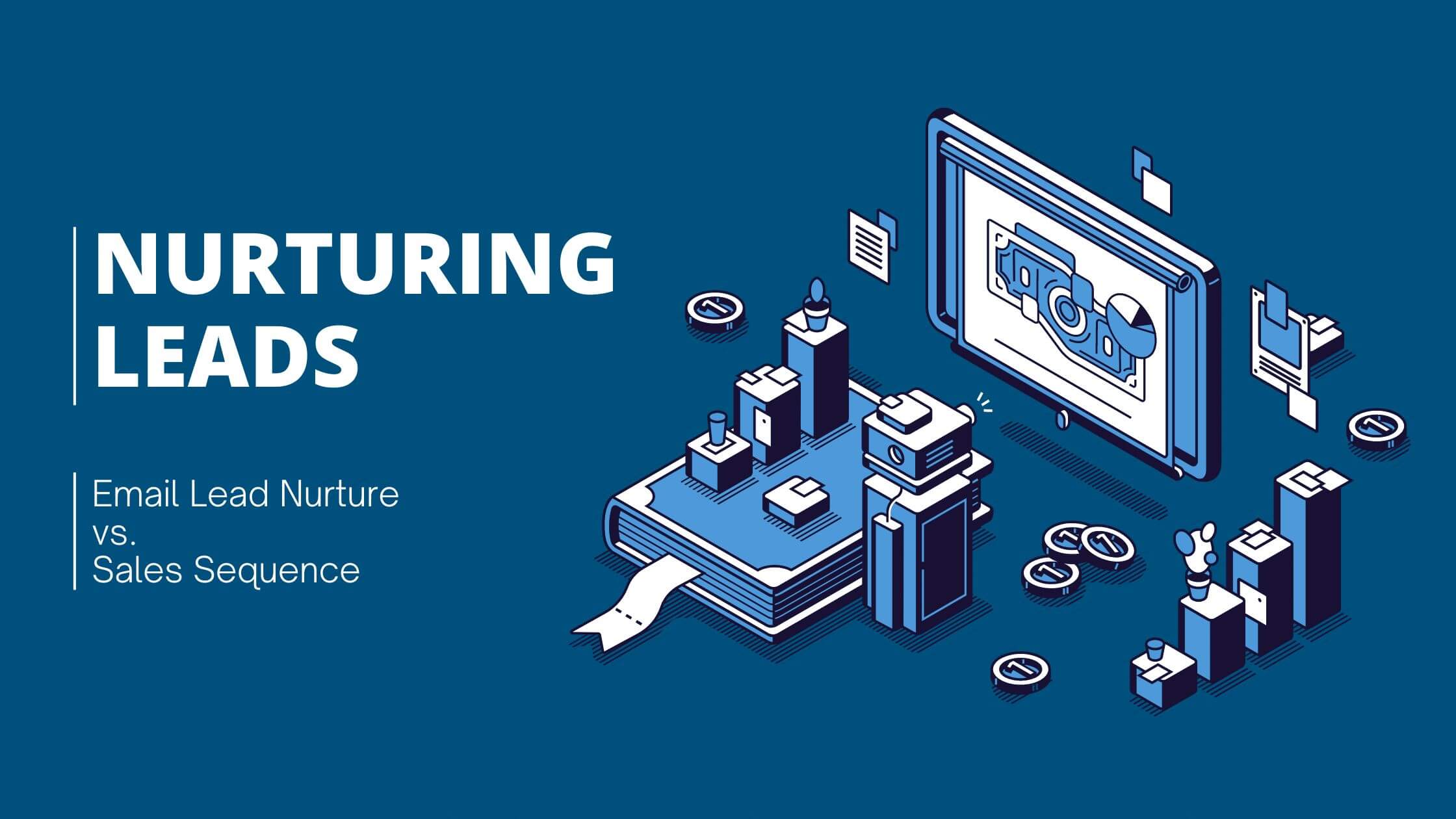
How Reddit Captures Bottom‑of‑Funnel Searches (and What Brands Can Actually Control)
6 min read02.09.2026
Google search results, AI Overviews, ChatGPT, and Perplexity surface Reddit threads alongside, and often above, traditional product pages. When someone searches “[Brand] pricing” they’re just as likely to see a Reddit discussion as your own pricing page. Here's how to optimize your content to influence BOFU searches.
Reddit ads for B2B deliver lower CPCs than LinkedIn, with 83% higher brand awareness when combining feed and conversation formats. Learn targeting strategies, ad formats, and proven B2B playbooks
Top Generative Engine Optimization (GEO) Agencies for B2B Marketing for 2026 and Beyond
10 min read09.08.2025
Compare the best Generative Engine Optimization (GEO) agencies for B2B brands. Expert analysis of 9 top agencies with results, pricing, specializations, and what to look for when choosing a GEO partner.
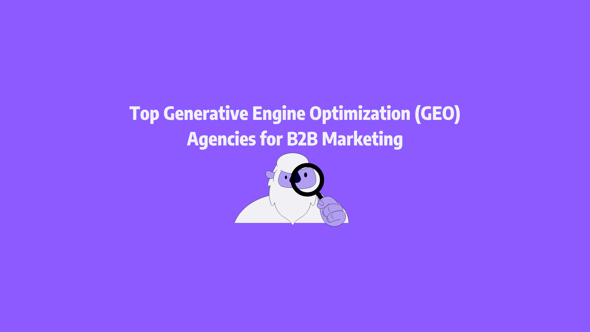
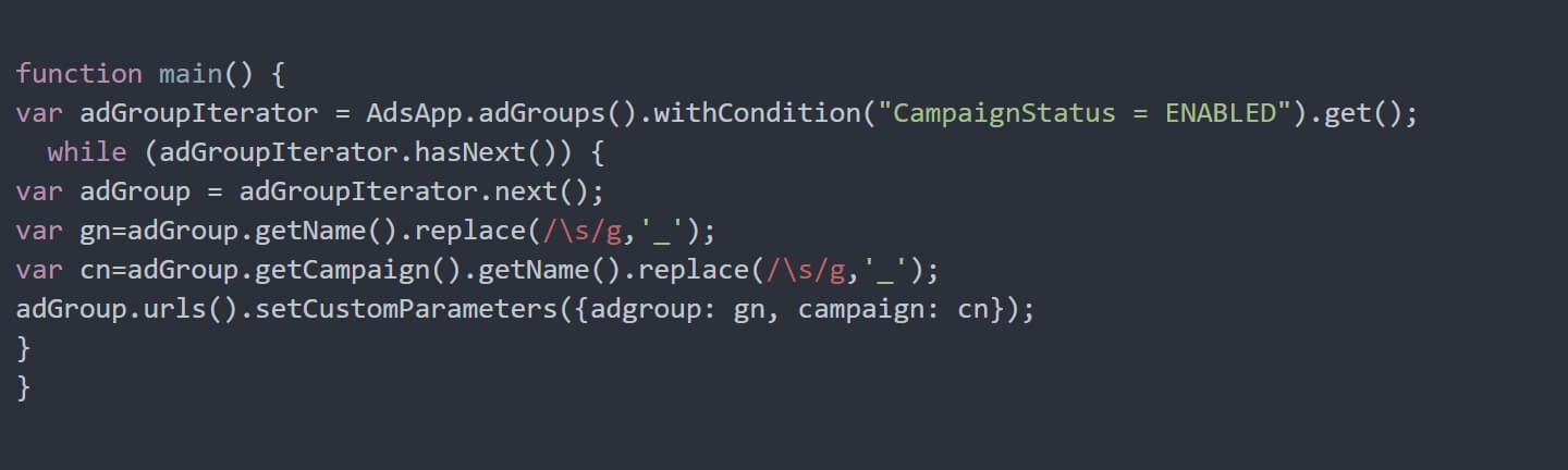
How to Export All Negative Keywords including Shared Lists from a Google Ads Account
1 min read08.29.2025
Our solution utilizes a Google Ads script to automatically create your custom parameters and insert the campaign name and ad group name, which can then be dynamically inserted into the final URL by referencing the custom parameters in the account level tracking template.
Why Reddit Ads Should Be Part of Every B2B Marketing Strategy
6 min read08.15.2025
Learn how pairing LinkedIn with Reddit Ads boosts B2B brand reach for higher impressions, lower CPCs, and cost‑efficient engagement from niche tech communities, all powered by Obility’s proven strategy
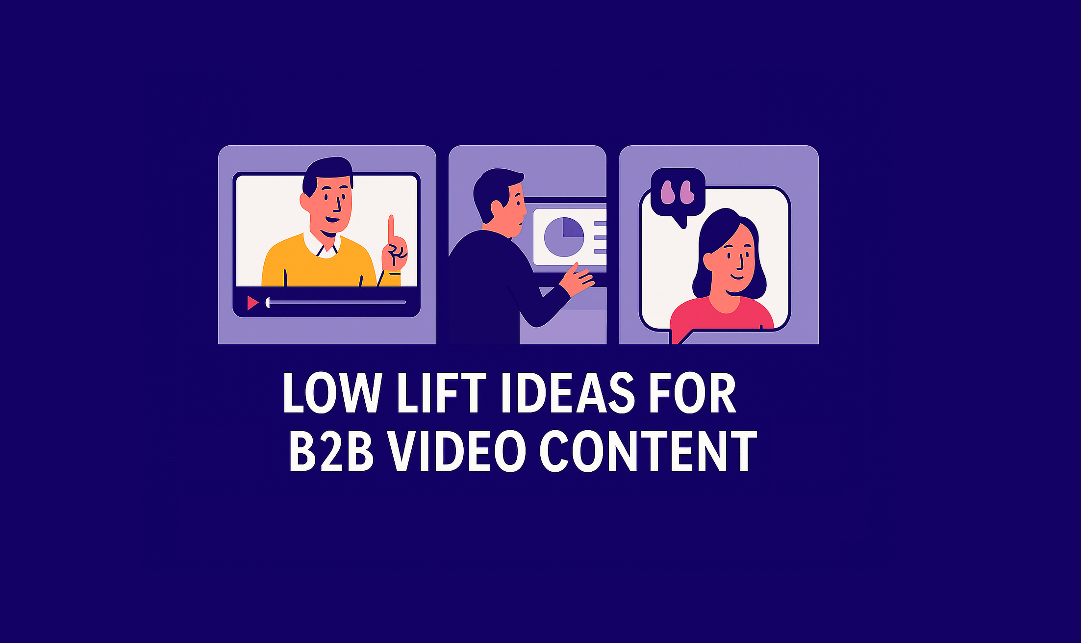
How to Make a B2B Video Strategy With Little To No Budget
5 min read07.09.2025
Learn how to create effective B2B video content on a shoestring budget. Discover 4 proven video types that drive results without expensive production costs or studios - start with just your phone.
You have certainly noticed the changes in the SERP with Reddit links ranking more and more, but how are you using it to your advantage? Read our guide to using Reddit to grow your SEO strategy to learn more.
Agency, Contractor, or In-House Hire: What Type of Marketing Support is Best for Mid-Market Companies?
6 min read12.20.2024
Are you looking for additional marketing support to grow your mid-market company? Read on to learn how to choose the best option for your needs, budget, and goals.
Preparing for Generative AI & Answer Search: A Guide from Obility's SEO Team
8 min read11.20.2024
The growth of AI-powered search engines has led many to examine their SEO practice and test out new strategies. In this guide, Obility will walk you through the four specific areas we are focusing on to be compliant with generative AI and answer search best practices.
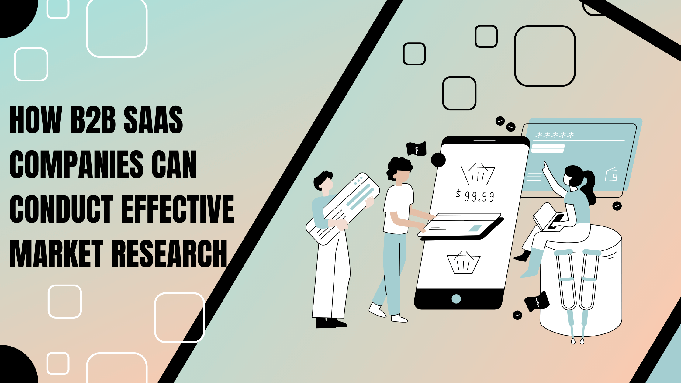
How B2B SaaS Companies Can Conduct Effective Market Research
8 min read08.01.2023
Market research is an essential component of any business strategy, especially for B2B Software as a Service (SaaS) companies. In this blog post, we will explore 5 key steps and best practices that B2B SaaS companies should follow to conduct effective market research.
Cultivating SaaS Success: Unveiling the Power of Customer-centric Marketing Strategies
15 min read07.20.2023
In this blog post, Obility will explore the pivotal role of customer success in SaaS marketing and delve into the power of customer-centric strategies that drive sustainable growth.
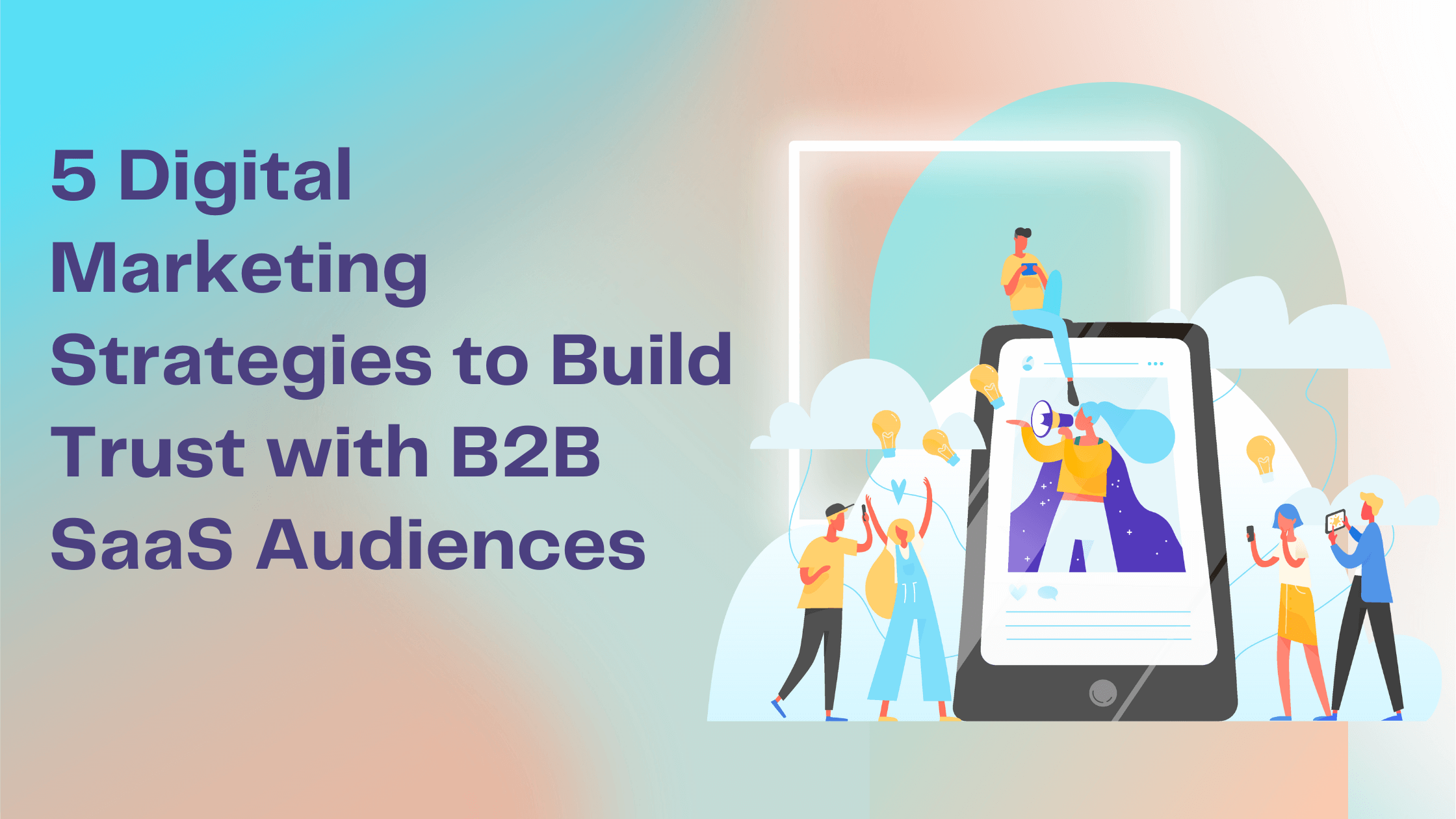
5 Digital Marketing Strategies to Build Trust with B2B SaaS Audiences
14 min read07.20.2023
B2B buyers are more cautious and rational and the sales cycle is much longer. In this article, we’ll share 5 key strategies that can help your B2B SaaS company build trust and forge meaningful connections with your audience.
Developing an Effective Digital Marketing Strategy for Software Development
20 min read04.30.2023
A well-crafted digital marketing strategy is essential for the success of any software development company. It can help you stand out, reach the right audience, and generate leads. Learn how in this blog post.
The goal of attribution is to optimize your marketing budget allocation so you can focus on the channels that have the biggest impact on conversions, MQLs, pipeline and revenue. These attribution models are designed not only to provide acknowledgement to marketing efforts, but also to measure the effectiveness of marketing campaigns and channels.
Brand keywords are often associated with paid search efforts, but many SEO specialists and marketing teams can overlook the benefits of an organic brand keyword strategy. While paid efforts tend to drive more branded traffic, having a strong organic brand presence will be important on quarter’s where money is tight.
How to Track and Audit Top Navigation Performance to Improve Conversion Rate
3 min read05.18.2021
The top navigation bar is one of the most utilized elements on your website. Learn how to create the necessary tags and triggers in Google Tag Manager, report on performance in Google Data Studio, and analyze the results to improve conversion rate.
Search Engine Saturation: Multiple Ways to Impact the SERPs
5 min read02.01.2021
Search engine saturation is the amount of space that search results occupy on a single search engine result page (SERP). This includes everything from images and advertisements to organic results. Search engine saturation is a tactic used not only in lieu of high ranking results, but also in conjunction with them; providing the searcher with multiple opportunities to reach your site.
Add Your Social Platform Pixels to Your Website Through Google Tag Manager
3 min read11.04.2020
Each platform provides you with a pixel tag that you can add into GTM in order to track overall traffic, conversions, and other courses of action on your site.
It may seem strange that the language we use when we talk about our processes and policies at a company has an impact on the culture, but I’ve seen this happen multiple times in my work.
Keyword research is the foundation of your SEO strategy and should be one of the first, if not the first document you work on. Read on to learn how to conduct SEO keyword research for your B2B business.
A few weeks ago I got the opportunity to host a webinar about B2B SEO lead generation with Moz. Watch the webinar on-demand to learn more about B2B SEO.
How to Choose Between Google Tag Manager and Global Site Tag
4 min read02.06.2020
Global Site Tag (gtag.js) is a new tracking tag created by Google and designed to gather all your Google tracking tags in one place. But should you choose Global Site Tag over Google Tag Manager? Learn more.
Screaming Frog is every SEO’s best friend. It’s very user-friendly but we can sometimes miss the deeper features that can make our life so much easier. Here are four Screaming Frog features that will help you make the most of our this great tool.
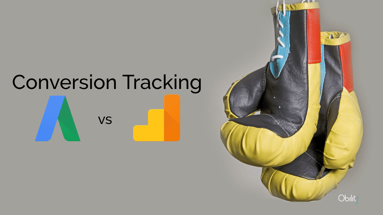
These two methods produce different conversion metrics based on the exact same user actions, understanding the differences will make you a better marketer.
3 Ways to Track Pardot Conversions in Google Analytics
5 min read04.10.2019
Tracking Pardot conversions can be challenging, especially if your forms live in an iframe. Obility walks you through 3 different ways to track Pardot conversions in Google Analytics.
Keywords are more than the sum of their parts. If you don't consider implicit search as a component of your SEO strategy, you're missing out. Explore the differences between explicit and implicit search queries and discover how to make the most of Google's algorithm for your content.
How to develop a Large-Scale or Enterprise SEO Strategy
7 min read03.11.2019
It’s not enough to take the same approach to optimize large-scale & enterprise site as you would on a typical site. Learn about the unique challenges of large-scale SEO and some of the top strategies for enterprise SEO.
How to Dynamically Insert Campaign Names in Google Ads URL Parameters
2 min read02.05.2019
Our solution utilizes a Google Ads script to automatically create your custom parameters and insert the campaign name and ad group name, which can then be dynamically inserted into the final URL by referencing the custom parameters in the account level tracking template.
With so much digital media usage on mobile, these best practices will help you optimize App Install campaigns through Facebook to reach your company goals.
Are Accelerated Mobile Pages (AMP) for B2B Companies?
3 min read12.19.2016
Accelerated Mobile Pages (AMP) create mobile-optimized pages that load almost instantly. We dive into whether this new tool is relevant for B2B companies.

 SaaS
SaaS